

Animated gif of the MemorySparx reusable components in Sketch.
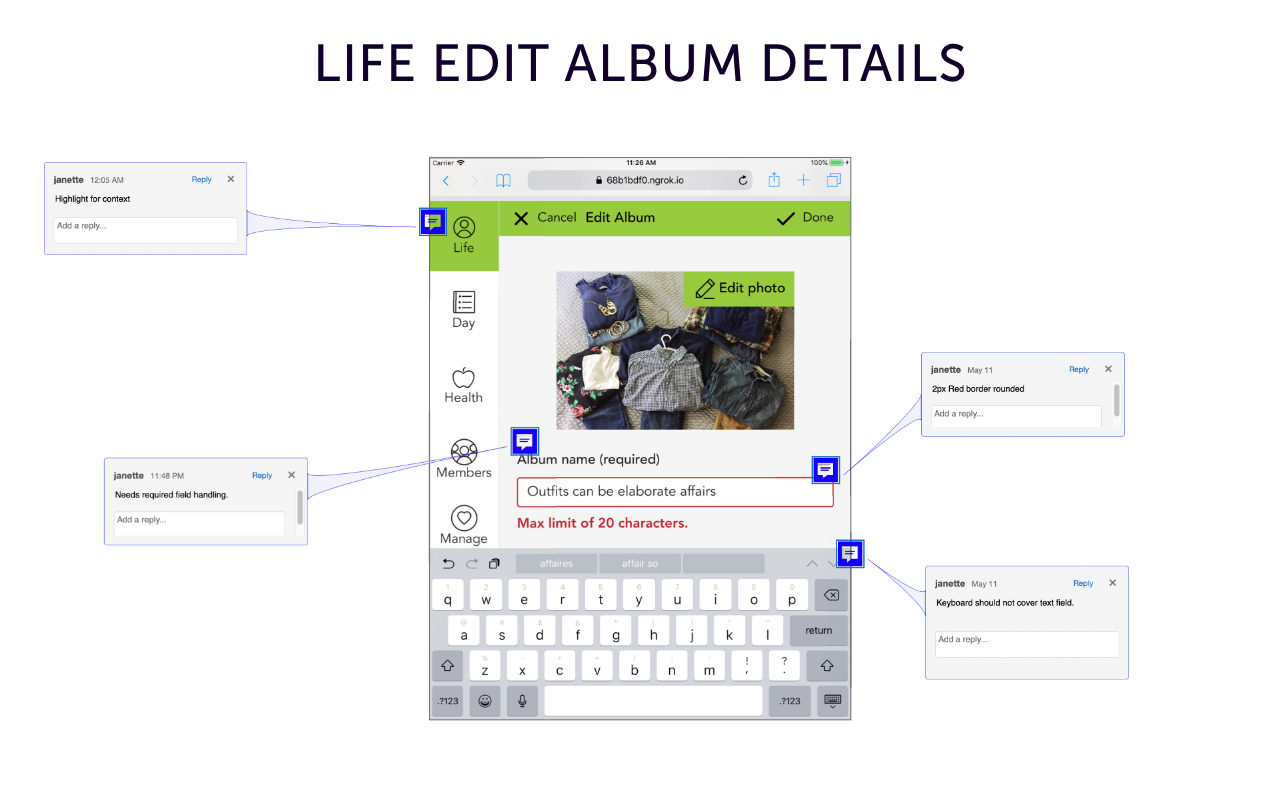
Life edit album screen with annotations.
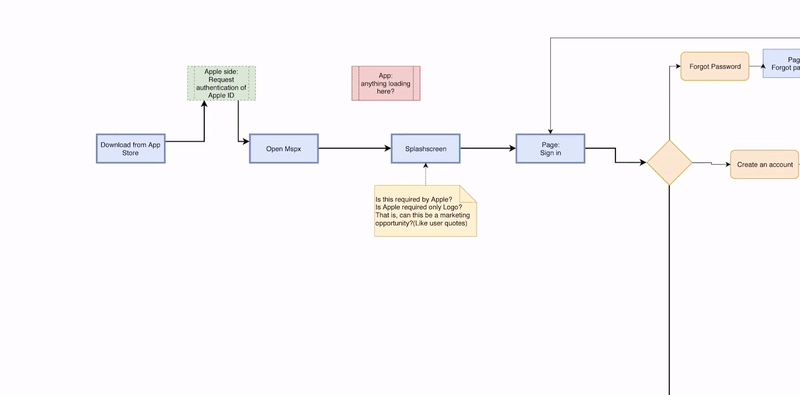
MemorySparx system flow

Source: Cowboy silhouette, 2020
Fig. Prototype for MemorySparx care provider section showing progressive disclosure and click-to-edit.
I re-skinned Material components to match our brand and WCAG compliance. The components are accessible and focused while maintaining the flat design feel.

Different font sizes and styles can draw the eye to different parts of the page, not necessarily from top-to-bottom. Source: designershumor, 2020.
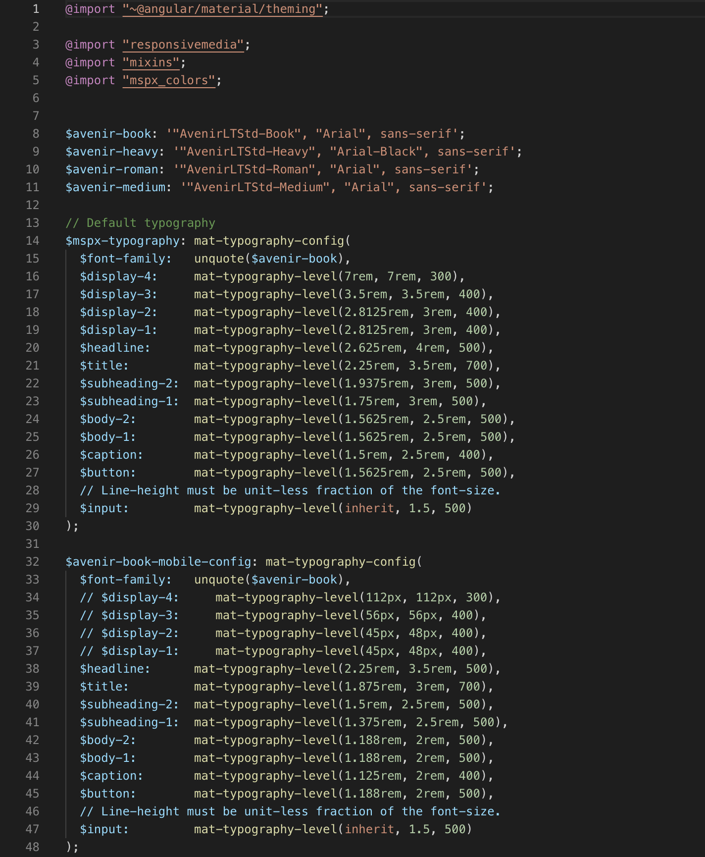
SCSS for Angular Typography configuration.
CSS for Memorysparx typography and paragraph styles.
CSS for Memorysparx typography and paragraph styles.
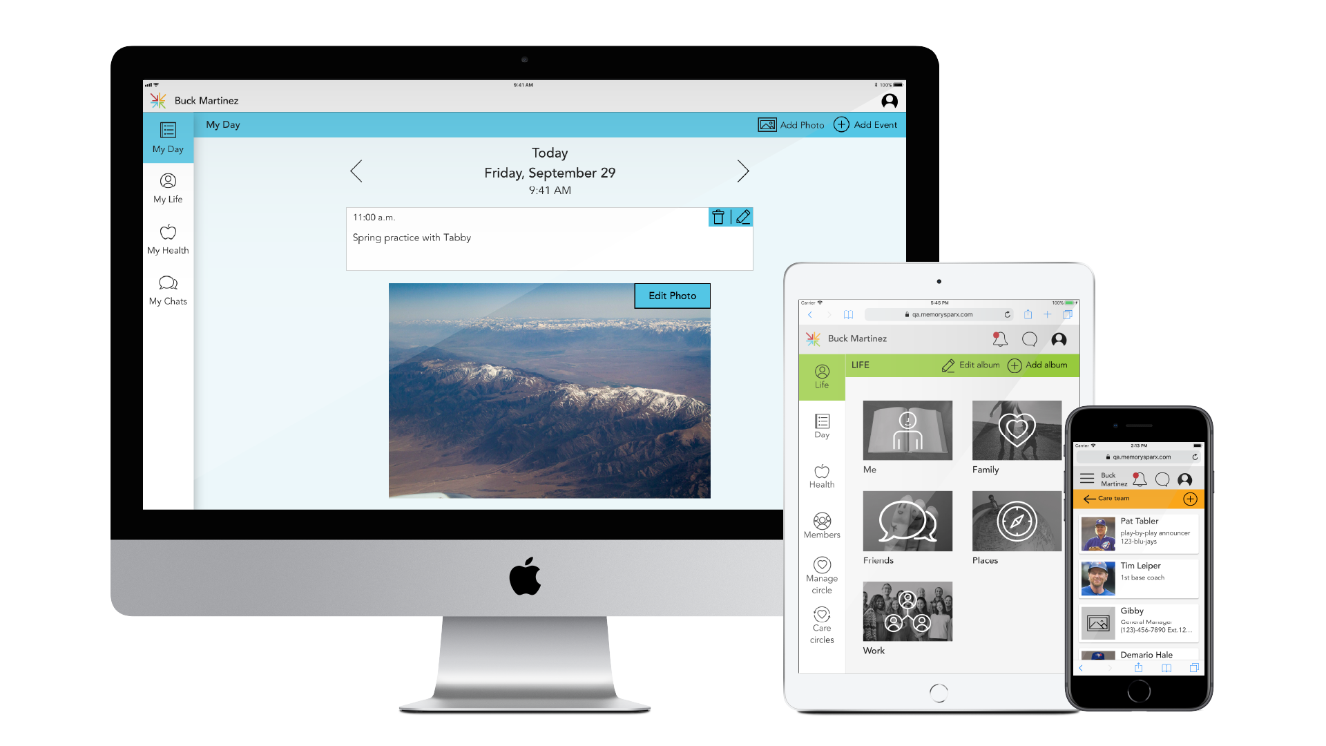
MemorySparx app and various ways of image display.
Sample SCSS for general images.
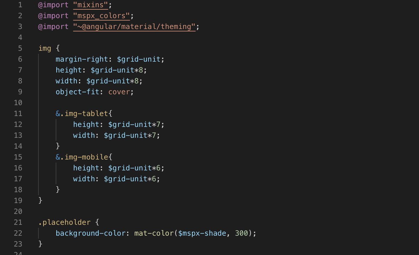
Sample SCSS for care provider images.
A component library is a must-have in a design system so the product team can create prototypes and implement features quickly and consistently. A sample for MemorySparx created in Sketch.

The proof is in the pudding. Source: Giphy,2020

Notifications list on iPad.
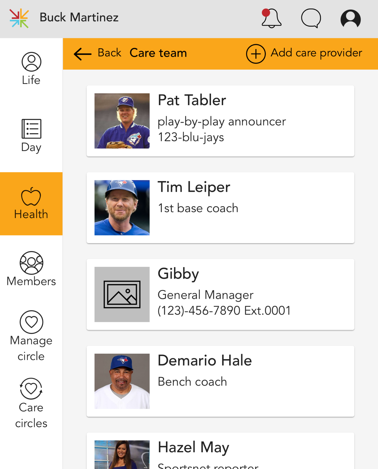
Compare with care provider list on iPad.