
Dashi is...
Dashi is an eagle eye view of your business and sales operations. It is a dashboard customizable to your needs, purposes, and situations.
Dashi is...
► a mobile sales tool to help you find the right leads at the optimal time and seal the deal.
► an analytics panel for diving into your operations and its needs.
► a team builder, helping you keep track of your team's efforts and challenges.
Dashi is the right information at the right time — helping you run your business like a well-oiled engine.
Diffuse Then Converge
I started off this project by diffusing, or “stretching my imagination” for awesome (and sometimes silly) ideas. Basically, I would generate a list of questions, which may lead to some answers, or more questions!
A breadth of questions I would ask:
► Who are my users?
► Why would they want this?
► What are their goals? What stresses them out?
► Why did I have this idea? What is its origin? How is it valid?
► Wouldn’t it be cool if…
► What is the current market? Does these other tools match the user needs? Why or why not?
► What do I need to know about this domain?
Who are the users?
What is the Market?
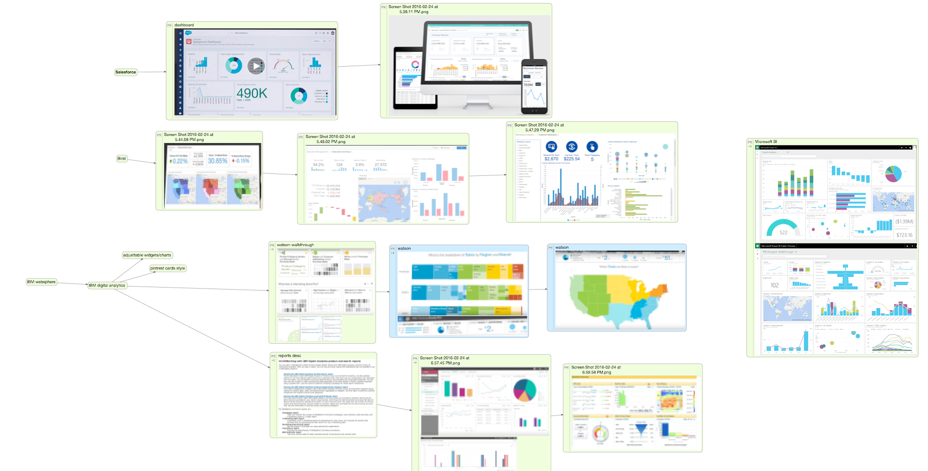
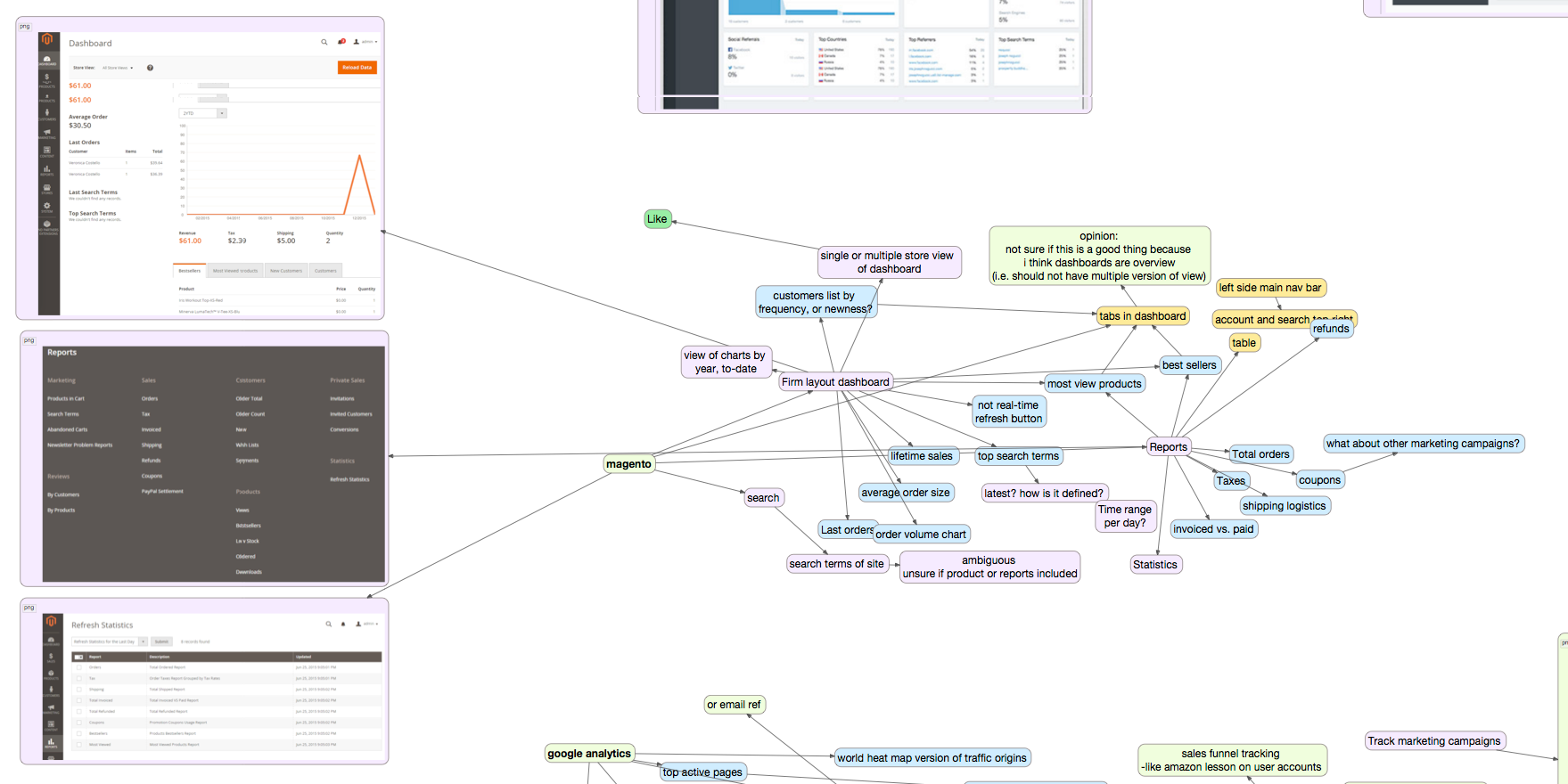
I looked into business development, marketing, and sales tools in this space. Some popular platforms were Magento, Salesforce, Oracle ATG Commerce, Shopify Plus, and most interesting, IBM's Digital Analytics using Watson.
I then converged on these products' ideas and made connections on similarities, and the reasons behind each design. (In a mind-boggling mind map.😅 )
How Might We...
I started to truly converge all the research and ideas when I framed the problem statement using a Googler's twist of IDEO's "How might we..." design-thinking tool.
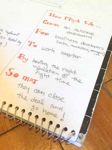
How might we… Create an awesome dashboard for business developers like sales, marketers, and managers, to work smarter by having the right information at the right time, so that they can close the deal and go home to their families!
Good Spirits Need Distilling
Design around content — just like form follows function.
Defining the content of the Dashi platform is probably the most important step before implementing a solution. Heck, it may organize itself into a solution!
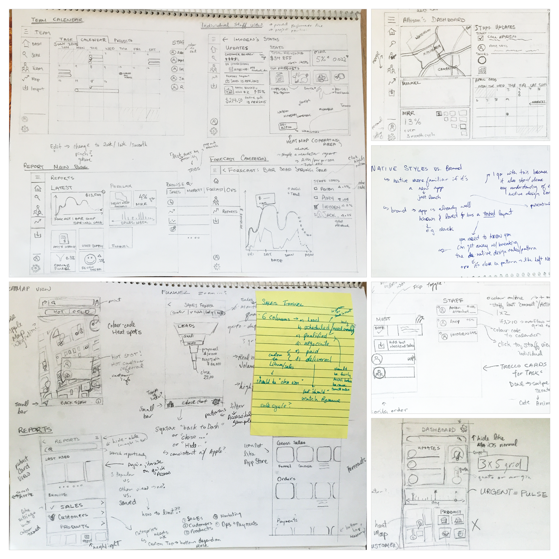
Since Dashi should be a customizable dashboard, I focused on each personas to create information architectures specific to the priority of each user. I used a method called "Application Distilling" to card sort into the following drawings.
Sketch-tacular
After defining the content, I turned the tap on my creative juices again and sketched on preliminary wireframes for these dashboards in both mobile and desktop views.
It is important to recognize that mobile and desktop can serve very different purposes. Users will likely have different priorities depending on the device they are using at the moment.
So, I went back to the distilling boards and organized concepts and features that suited each device best. Mobile will tend to have more on-demand features, while desktop will have more in-depth analytics. For example, a salesperson’s mobile view will have information at hand that can quickly close a deal. In Liban's case, it is a great opportunity for him to know where the nearby clients are located from his smartphone and be able to sell the excess hummus quickly.
These wireframes helped solve problems with fitting a lot of information in limited spaces. It made me think about what is meaningful information and where to locate it.
Play with it!
Here is a video mockup of Dashi's desktop application in Microsoft Window's Metro style:
Behind the Scenes: Mobile
I decided to design the mobile version first because the space and power constraints narrowed the scope. Mobile apps really boil down the priorities for a clean and engaging user experience.
This mobile app is designed as iOS app and follows Apple’s styles and human interface guidelines to define structure. It mimics a look-and-feel as similar to iOS as possible to enhance user familiarity, and this should reduce learning curve. For example, the bottom navigation bar is common to many Apple’s iOS apps such as the App Store and Health app, the map layout is similar to Maps app, and top products are listed similar to the App Store, etc. I relied on Facebook’s iOS UI kit to mock the app. The font family is San Francisco and iconography is mainly from the UI kit, with some improvisations.
The Dashi platform is made as an enterprise application so it can be skinned with a company’s branding, like custom colours and labels. I found this became a challenge in a data visualization application because it needed numerous colours (and textures) for differentiation. Currently, this app defaults to high-contrast primary and secondary colours in these diagrams because these colours are most accessible. Further on, I think it would be interesting to explore using algorithms to play on a brand’s colours as a solution.
One of the biggest challenges I had with layout of the mobile content is the delicate balance of how much information should be displayed on a small screen. What are visuals are valuable? What information should be viewable immediately versus punting to the next screen?
I decided to use some heuristics to efficiently lay out the information, such as using images to evoke quick recall, making sure clickable areas are sufficiently large, drawing skeuomorphic visuals, etc. However, I discovered the simplest way to solve this challenge is to focus on the specific user needs.
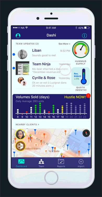
Focus on Liban’s Priorities
I have built the above mockup specifically for Liban, the salesperson persona. From the distilling activity, I determined Liban’s goal on a mobile device was to be able to act quickly on urgent and on-demand tasks. Hence, I organized his home screen dashboard as follows:
Respond quickly to customers — At this point in his small business, Liban is both sales and customer service. The inbox is added at the top because it is important to service customers and new leads promptly.
Know the inventory — Liban’s business is small and lean, so there can be surges in both supply and demand. Being able to keep track of his hummus supply in real-time with a gauge can help coordinate logistics with his team. This hummus gauge is a unique and custom feature for Liban and it highlights the possible meaningful visuals users can have with data. Another inventory tracking feature on his dashboard is the list of popular products. This list lets him know what’s available and popular on demand when he is selling to a potential customer.
Location-based leads to sell more products — There was a consensus among business developers that knowing your sales’ origins is key to growth. This is the reason for the hot-spot map feature. The map highlights where his frequent customers are, where leads have gone cold, and key networkers who can connect him to more leads. This information can make Liban very efficient with cold calls and make those impromptu connections. For example, he can refer potential customers to actual customers in the same building to vouch for his products and create hype.
Know his performance — His personal sales funnel chart was added at the bottom of the dashboard to help him keep an eye on his pace, and allow him to be more agile on each stage of his sales process. Liban will be able to know and improve right away if there’s a stage that isn’t converting by observing the steepness of the slopes.
Encourage data-driven habit — Having a good amount of data can help drive confident decisions. Therefore, it was imperative to add the import function to the main navigation bar to establish a presence in the app. This should make it easy for Liban to quickly record a conversation or invoice to the system. In the future, adding third-party software integrations like Salesforce, can automate the data intake process and off-load this responsibility from the user.
Behind the Scenes: Desktop
The desktop Dashi app is where users do more in-depth business intelligence analysis, find answers to complex root causes, discover new markets, and explore ideas.
This desktop version is based on MS Windows Metro styles and design guidelines. The app mimics a Windows 8/10 look-and-feel to enhance user familiarity, reducing learning curve on such a content-heavy application. I relied on MS Window’s UI kit and Windows 8/10 default apps as references to mock the app. For example, I referenced MS Outlook and Bing Maps for the team inbox and regional sales map respectively. I styled the “Best Sellers” list after pictorial Metro tiles in hovered state because words on solid coloured background is more readable than words directly on multicoloured image. The font family is Selawik (because I’m designing on a Mac), and the iconography is mainly Winjs MDL2 Symbols font with some Webdings glyphs. Similar to the mobile version, the Dashi platform is an enterprise application so it can be skinned with a company’s branding, custom colours, and labels.
Again, there is delicate balance between valuable and manageable information to the user that will not overwhelm them. Focusing specifically on Allison’s needs really help define her dashboard content and layout.
Focus on Allison’s Priorities
My secondary marketing research showed that business managers’ biggest endeavour is maintaining the health of their teams. Allison should be no different. Given her needs, and the affordance of analytical work on desktops, I organized her home screen dashboard as follows:
Taking care of her team of artisans and their customers — Her team and customers are at the forefront of her dashboard. Her inbox and her calendar show the nitty gritty relationship details between her and her team. She can interact directly with each of the events and tasks from the main dashboard, above the “fold”. These widgets should help her take care of urgent and important matters.
Overview of team performance — The customer churn (MRR), team sales funnel, and the custom artisan revenue charts are meaningful metrics to Allison in order to understand her business. My research concluded that monthly return revenue was the second important item for business developers (after sale origins) because it infers the sustainability of the company. Similar to the mobile version, the sales funnel shows performance of the team at each stage of the sale, and she can also drill further into the analytics comparing individuals. The custom artisan pie charts is a visualization of her team members in comparison to each other, and is valuable for demonstrating quantitatively each artisan’s operation. These diagrams help Allison identify group needs and pains promptly so she can make data-driven decisions.
Oversee health and growth of the market — The value of collecting data over time can also be used to forecast potential growth and trends. For instance, the Volume Sold graph displays the current sales progress in coloured dots, and using historical data, predicts potential sale volumes in the coming days (depicted by translucent white dots). Another example is the Sales by Region map. It shows key areas where her artisans are making sales, and where sales have cooled. Knowing these origins and its performance over time can help Alison understand the reasons behind hot markets, and focus on efforts to turn cold areas into hot markets, or add campaigns to drive new markets. Forecasts and trends are very powerful tools for Allison to stay ahead of the game and to guide her team successfully.
Analyze business in-depth — The desktop version also packs more business intelligence tools when Allison wants to drill further down into different metrics to find answers to issues and growth. She can search conversations with each of her artisan clients, compare sales funnels of individuals or over different time periods, query her data for artisans’ operation costs versus profits, make performance reports so she can guide her artisans with confidence, etc.
Learning from Others
I was very lucky to get some feedback from a few people, one of them were a designer who has experience with business dashboards.
► Balance between too much information, and not enough. There seem to be a very personal and delicate level with each tester. Some liked it cleaner, more whitespace. Others wanted all the numbers.
► Always test your assumptions. Not everyone knows what a gas gauge looks like.
► Some testers were impressed that it was visually accessible, given the density of content.
► Feels easy to use once it is set up. There is some familiarity with the iOS look-and-feel.
Does this project peak your interest? Let's talk about it with me@jnetix.com.