Hello!
My name is Janette.
My name is Janette.
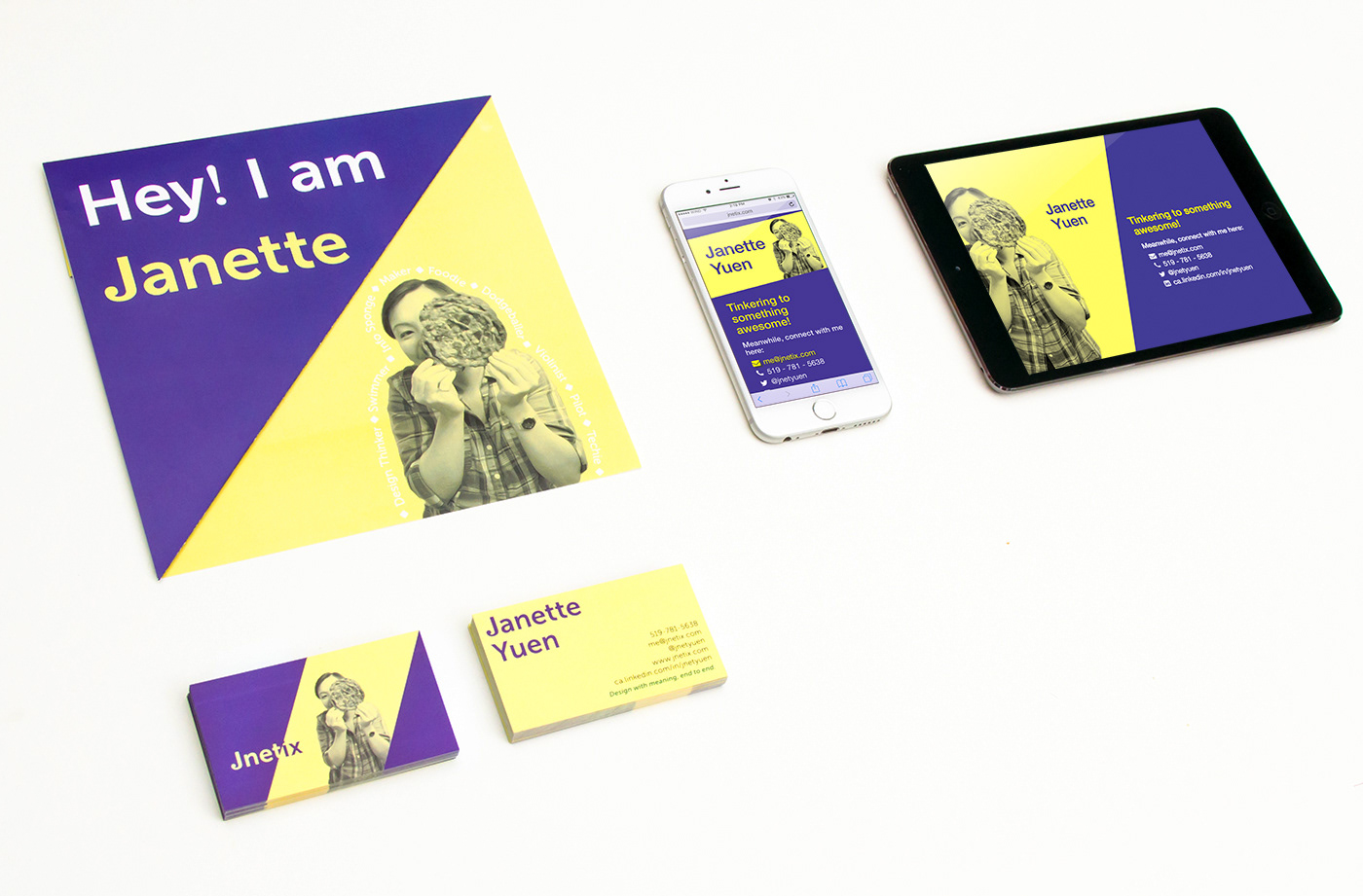
As I began my journey into UX design, I needed an unique and marketable way to showcase my diverse skill set in the technology and design industry. Thus, I created a graphic print resume, business card, and web page with an consistent theme.
I really liked the idea of parallelograms and triangles because they signify forward motion.
I wanted a clean, fun, and creative resume. Living in a town with an abundance of youthful startups, I knew my audience appreciated fun and innovative aesthetics.
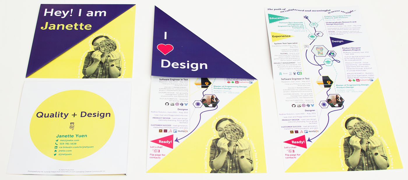
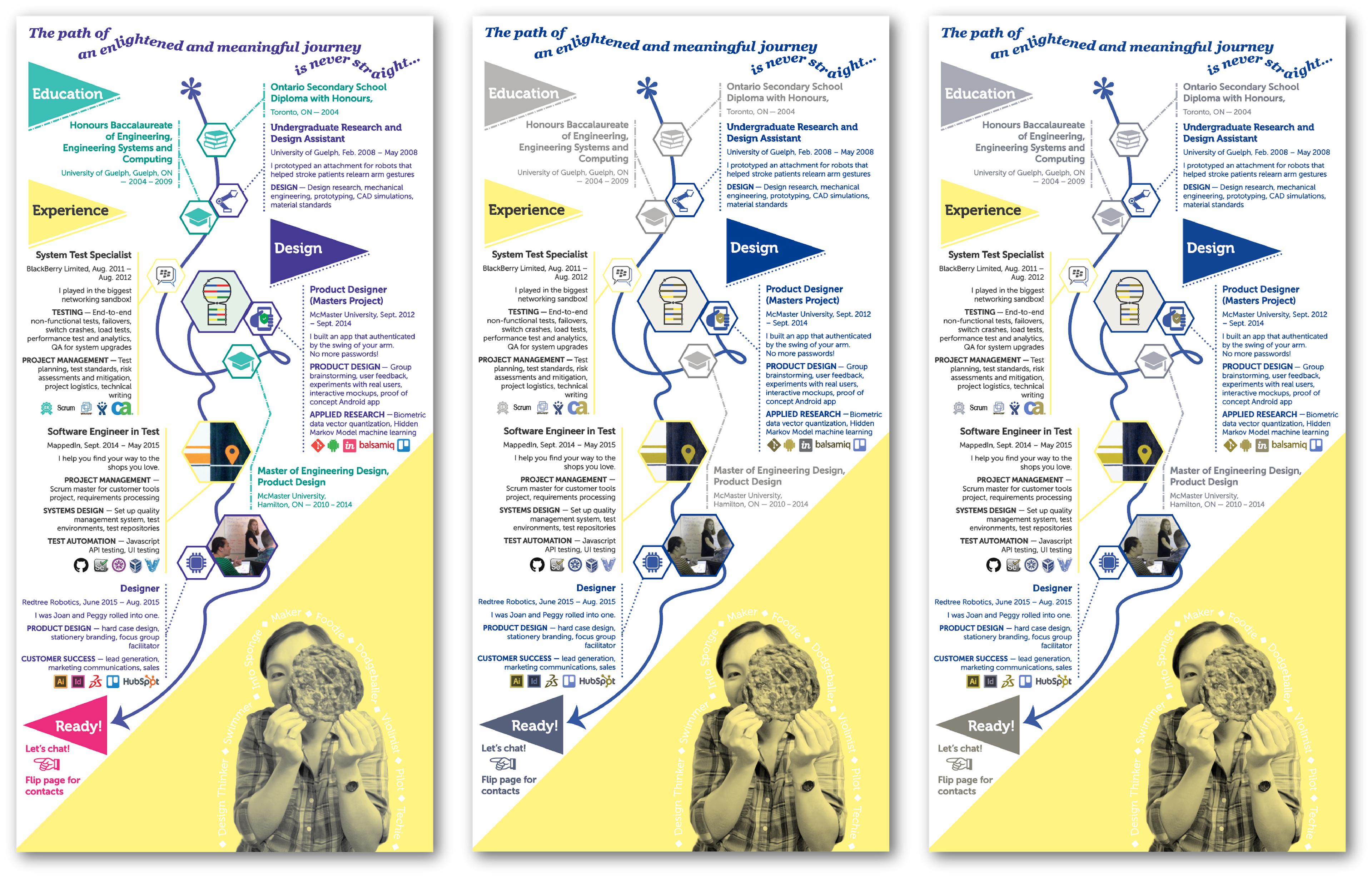
Top-left: front page. Bottom-left: back page. Center: intermediate fold. Right: inside, the main content of the resume.
The print resume was inspired by Moorhead's and Rosli's graphic resumes, who were able to incorporate the folds of the paper into the theme and user experience. I incorporated an angled fold to create a right-angled triangle, where both sides carried a clean conversation and introduction to my story.
Of course, my work and design experience is the content inside the brochure. Each block of information branches out from a curvaceous timeline — because a real life’s journey is never straightforward. The blocks are colour-coded, pattern-coded (branches), and organized by categories: education, work experience, and design experience.
I have also added logos for the tools I have used in the past. I have decided on logo graphics for this section to save some space, add more visuals to my resume, and demonstrate my diverse set of practical skills. Moreover, having employers recognize the logos can give me a good indication of their understanding of the desired role to fill, their work processes, and a common ground for conversation.
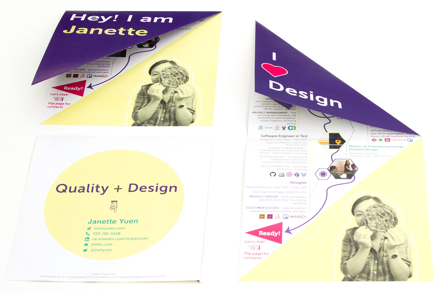
Top-left is the front page propped up. Right side shows how it opens up to the inside and is also propped up.
Bottom-left is the back of the brochure.
The back page summarizes my value proposition: quality and design go hand-in-hand, and I make good use of both assets. Quality can be defined as fitness for purpose. In the software industry, it is known as conformance to customer expectations and user requirements. Similarly, design aims to create human-centred system for a specific purpose. Together, these virtues come full circle to build meaningful and valuable systems to all stakeholders.
Quick Specs
The full size of the resume is 8” x 16” and the folded size is 8” x 8”. I wanted it to be at least 8” in width so it would not get lost in a resume pile at a job fair. The content fits nicely in the portrait orientation, and the up-to-down experience works better with the folds.
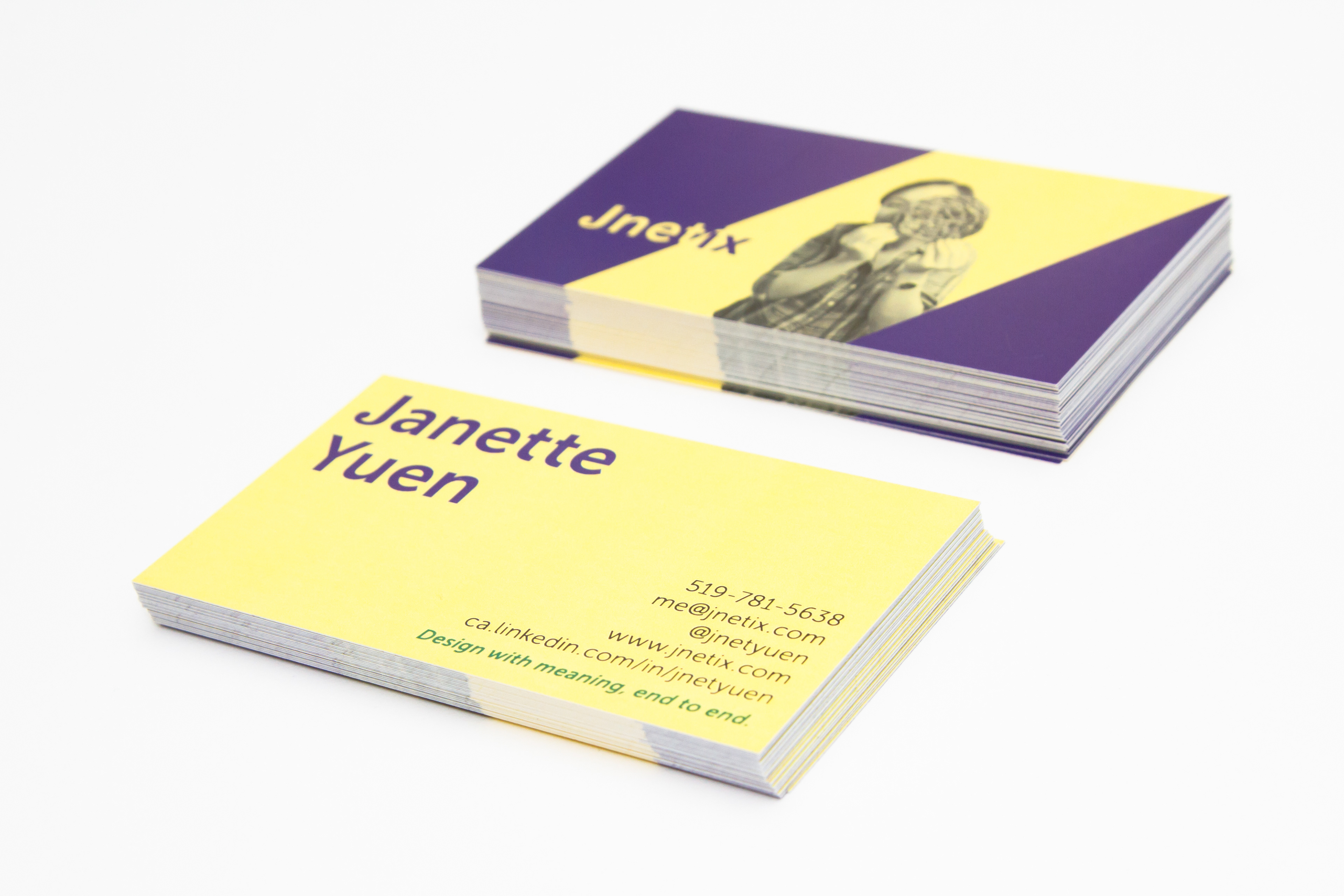
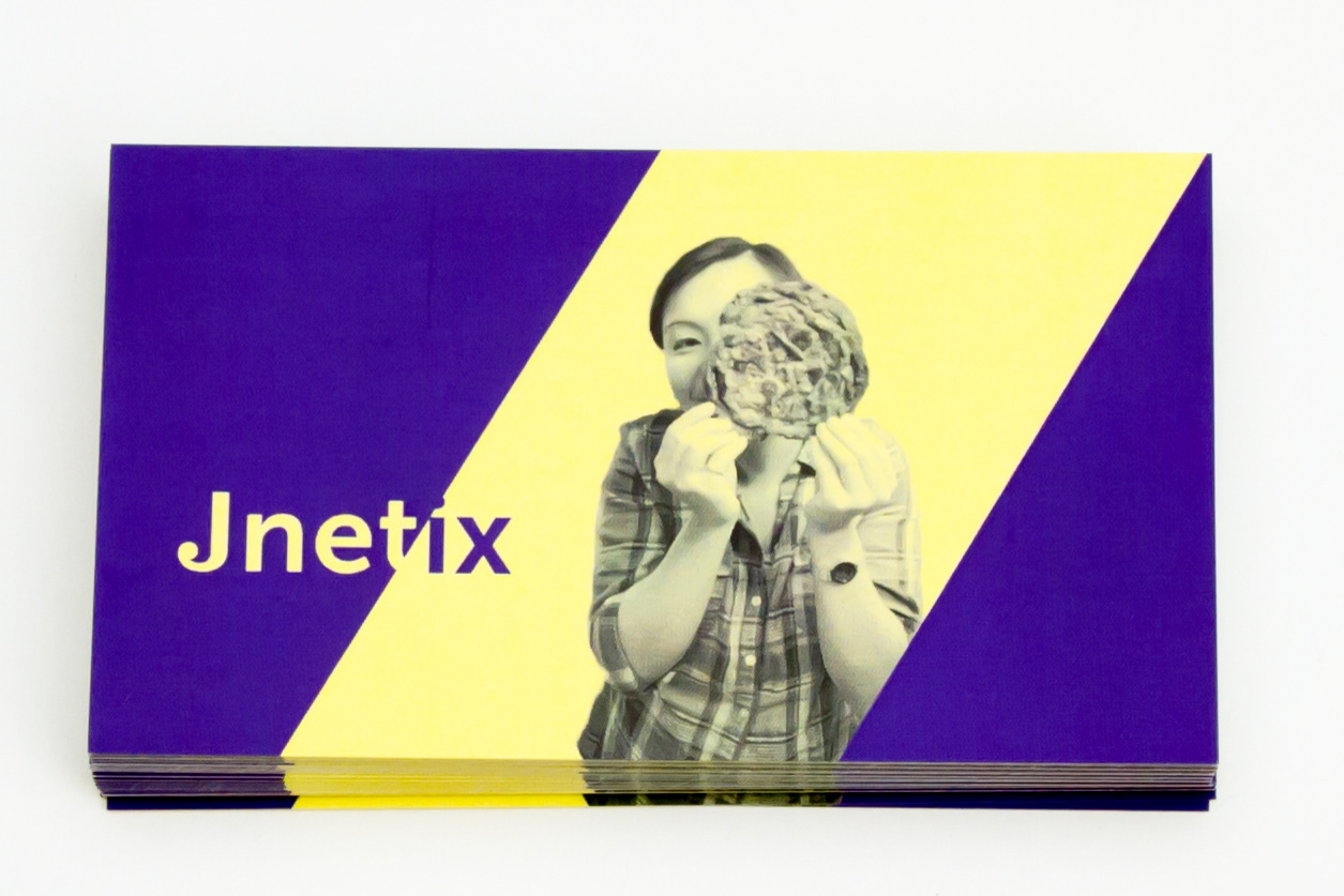
The business cards are standard American business card size at 3.5" x 2". They are made of no-tear polymer material, at 11 pt. thickness, and has a silky matte look-and-feel.
The typography is mainly Museo Sans, which is modern and easy to read. I also used Museo for category headings, Georgia for quotes and some (cheeky) accents*.
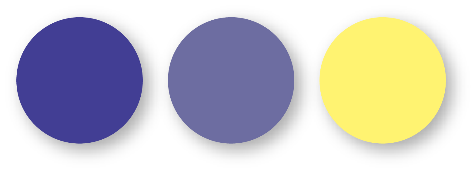
Complementary Colours
Accessibility is important to me since I come from a professional quality assurance background. Hence, I used the complementary violet and yellow as my primary theme colours. These colours have about 6:1 contrast ratio and I love saturated colours for the eye-catching pop!
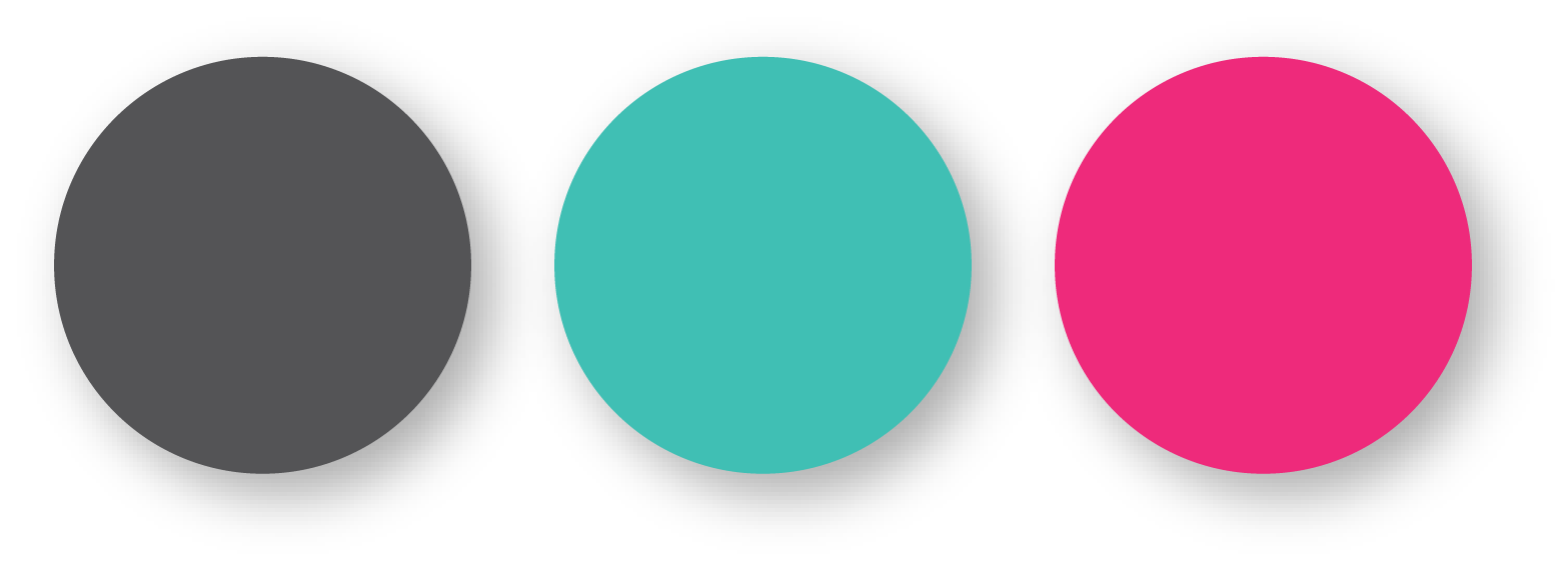
I specifically chose violet for being more gender neutral than the basic purple. I am aware of stereotyping, especially in the tech industry, and I wanted to move away from it. Yellow is also one of my favourite colours, and it expresses happiness and energy. The secondary colours, turquoise and fuchsia, were chosen at similar saturations for accessible contrast ratios, and to match the theme.
Primary Theme Colours
Supporting Theme Colours
*Cheeky Accents
Did you spot anything quirky?
In Scott Dadich’s article in WIRED magazine, he talked about the design of wrong and how one can selectively break one or two rules for maximum impact.
So yeah, I did it. I broke a couple of rules.
And you know what? It’s exhilarating!
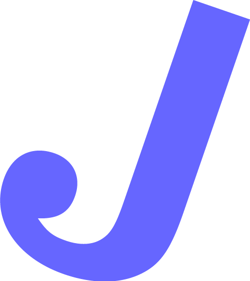
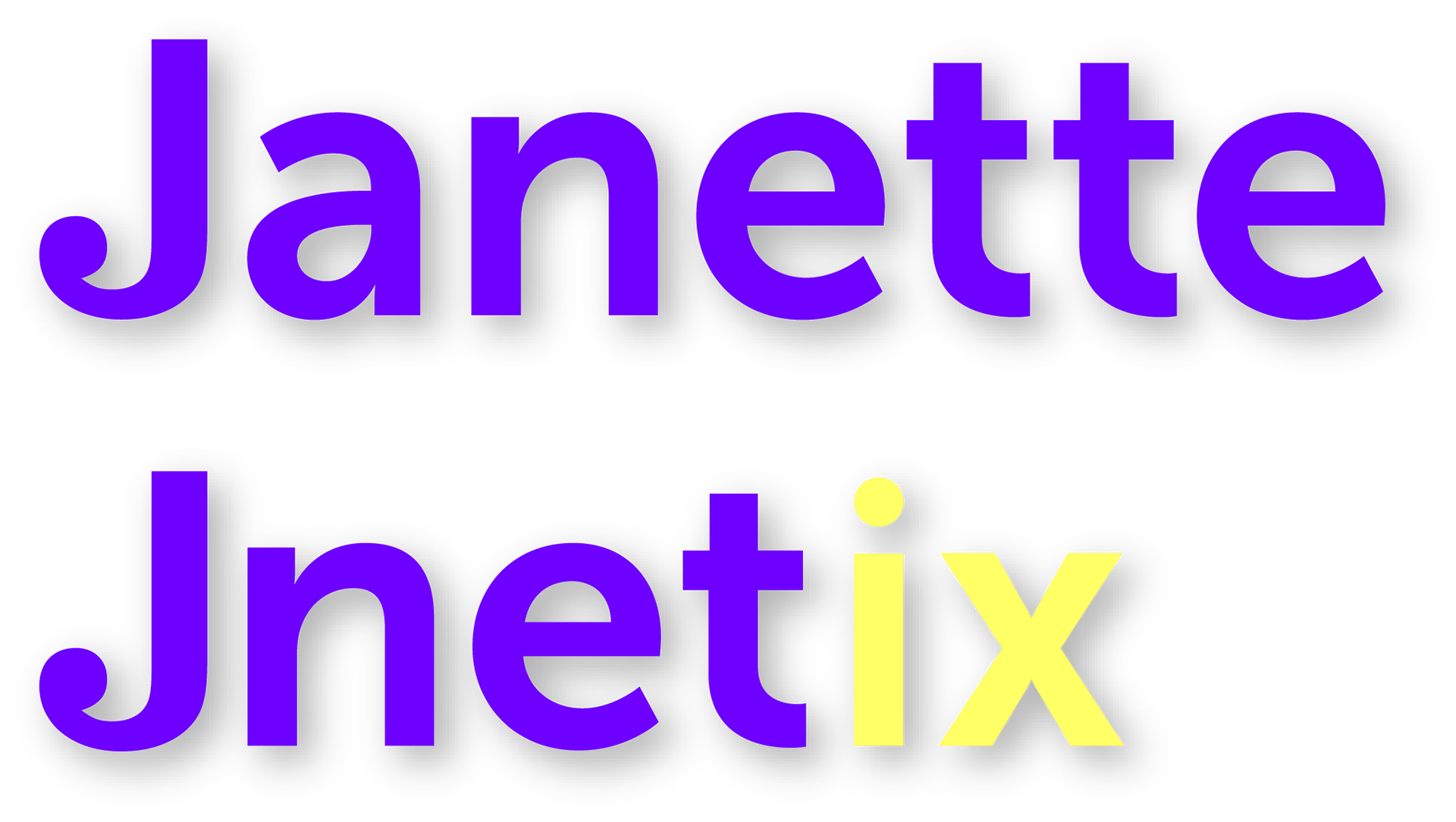
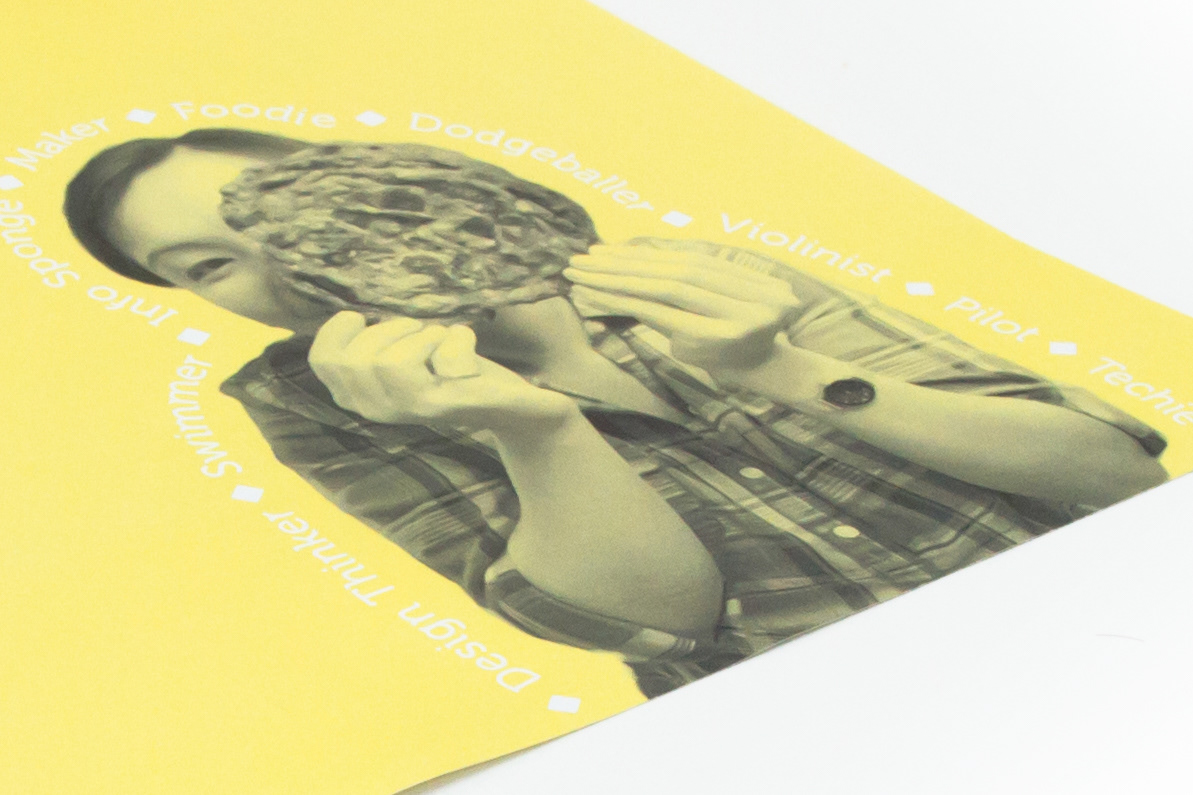
Left cheek: the "J"
The letter J is a fuse of Clarendon and Museo Sans. I love the random ball terminal. I think it is a suitable brand identifier.
Right cheek: the text outline
The text outlining the portrait lists some of my interests. Keeping with the fun theme, I wanted the audience to know what I like to do for fun, at the same time I did not want to take away from the impact of the very first glance at my resume. I know this does not meet accessibility standards, but the outline is a playful little flourish. Cool?
Was this worth upsetting my graphics design friend?!
Ok, last easter egg...
Jnetix is my brand name. On my business card, I have the slant running between the “t” and the “i” because Jnet is the short form of my online name, and ix also stands for interaction in interaction design.
Accessibility
As I mentioned above, I have a good understanding of web accessibility standards and I definitely applied some of these features on both print and digital media.
My Quick Usability Checklist
✓ Verified soft proofs for colourblind accessibility
✓ Verified font colour contrast ratios. All colours are 4:1 on white and yellow background (with the exception of the yellow on white)
✓ Branches from each block of information are patterned coded (i.e. solid, dashes, and dots) for the visually impaired
✓ Timeline objects are separated into categories (education, experience, and design)
✓ Layout per information block is consistent with each other. Information should be scannable.
✓ Proofread by other humans!
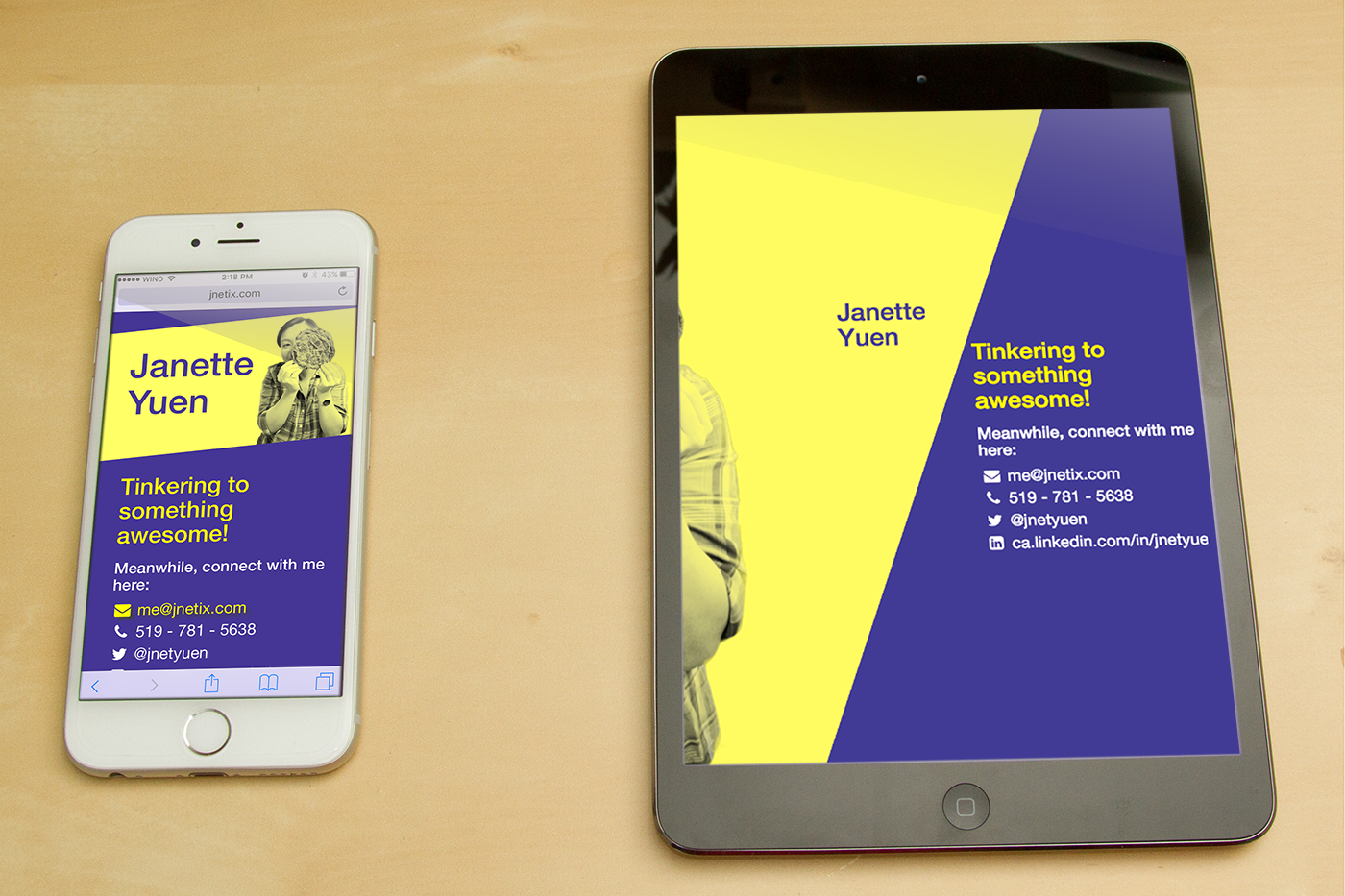
Simple but responsive web
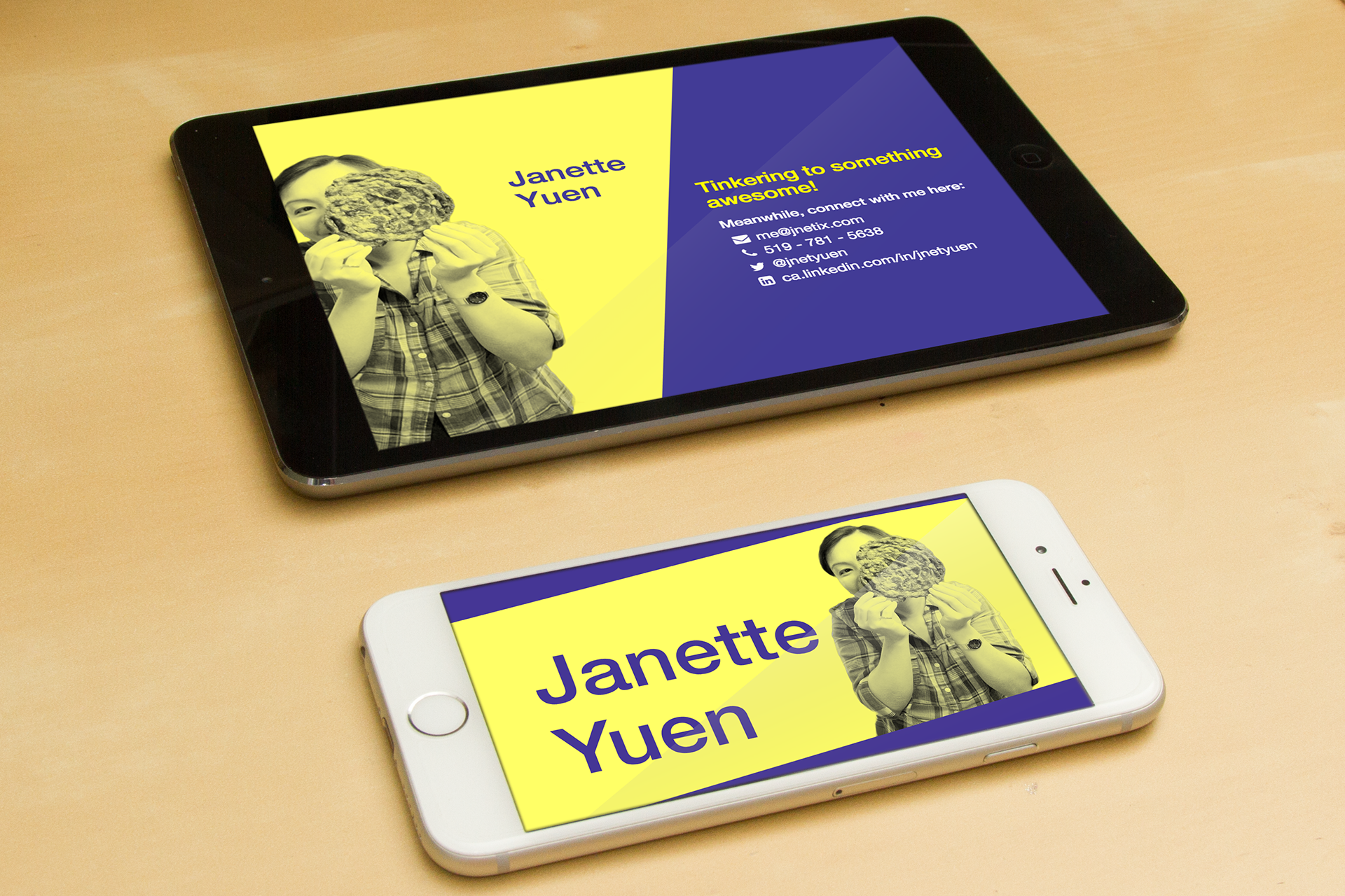
One of my strengths is understanding web design. Even though the simple landing page is only temporary, it was essential to be responsive for ideal viewing on various devices. I also have all my contact information readable on single page glance on as many types of devices as possible.
I have kept the landing page bare-bones HTML and CSS with some use of Bootstrap.js and Font Awesome, so the page is fairly low maintenance. The backgrounds are SVGs, which are nicely scalable. My page is hosted on GitHub and can be access by my domain jnetix.github.io.
Lessons Learned and Next Steps
1. When considering brand colours, print is the lowest denominator. It’s a lot easier to maintain consistency from print-to-web because printers+papers+inks have a much smaller colour gamut for crisp and accurate colour digital printing.
2. Spot colour for the violet! Violets were difficult to adjust correctly from sRGB to print CMYK. Both my screens have been calibrated, and I set the correct profiles from the printers for digital proofs, but it was still a challenge.
3. Hard proofs FTW! I am a big believer now in local print shops.
4. The content inside the resume turned out looking more cluttered and needed more negative space. For my next revision I will revisit the paper size and perhaps work with gate or map folds.
5. The feedback for the resume from the last job fair I attended was mostly positive. Many hiring managers loved the unveiling. More importantly, managers looking for design and business analysts skills were able to focus on these items, even when they were under software testing job titles.
6. I did find a couple of technical hiring managers who were less enthused about the graphic resume and wanted my detailed technical CV, because the jobs were more business analyst and project management roles in hardware and robotics industries. Traditionally, these industries are not heavily focused on human-centred design. However, I believe this design ideal will become more ubiquitous with the internet-of-things trend. And when that time comes, I will be ready to design meaningful systems for them. :)
My next step is to expand the web page into a full portfolio site.