Furrowed brows usually means...
“Houston, we have a problem.” 😣
Usability isn’t just a checklist of tasks to complete. I have found observing user behaviour is crucial to developing good designs. Facial expressions are extremely valuable because these looks communicate with us even before users can verbalize a feeling or a problem.
When I first started at Emmetros, I came across looks of “wrinkled brows and pursed lips” on teammates and comments of “this isn’t what I was expecting…” and “it doesn’t look right…”, when they started to play with the first iOS app release candidate. These exasperations are hints at usability issues and it became a good opportunity to get my hands dirty and review the product in depth.
State of the union
Review the product story
To effectively improve a product, I needed to know the team and their product’s story. What is the story we are trying to tell?
Most important: Talk to the team
► Understand the core vision of the product from company leaders. Simply put, the MemorySparx software was a memory aid for people with cognitive impairments to live independently with dignity.
► Talk to team members about their processes and their needs. The company operated on a waterfall approach where research, collaboration, and planning were heavily upfront in the process at the leadership level. Leadership produced meticulous documentation and customer requirements, but the product team had challenges interpreting these details, and procuring additional resources for technical execution. Evidently, I could facilitate bridging this gap with concise problem definition and solutions that are deliberate, explicit, and feasible.
Play with the product
Understand user’s goals and their stories
A walkthrough of the product was vital for me to empathize, understand, and then define the goal of each workflow. I was able to experience what the user can see and do with the app: the on-boarding journey, how they add/organize content, accessibility of the product, etc.
Run QA’s manual test suite
A good way to experience the app was to run through QA’s sanity tests. Sanity tests are great application of the Pareto principle (a.k.a. 80/20 rule). I stepped through the popular user flows (20% of “causes”), which exposed 80% of the product’s capabilities(“effects”). An added bonus was helping QA complete these tests as part of a release, and I was also able to observe their testing behaviours.
Since accessibility of the product was a priority, I also carried out simple usability and accessibility tests to determine/quantify the work needed in future designs to bring it up to AODA standard. E.g. “Usability Checklist” (https://teamsuccess.io/UX), Deque’s Axe Accessibility checker, and a WCAG 2.0 checklist (https://webaim.org/standards/wcag/checklist). These tests have also became a part of QA processes.

The left-handed oil test. Testing the usability of kitchen gadgets. Read about it here. Source: Epicurious, 2019.
Map the system design flow
As I walked through each workflow (e.g. product discovery, onboarding, creating content, etc.), I mapped these workflows as one connected system design flowchart with Draw.io.
This system design flow was a great tool for:
► Discovering and defining conventional UI patterns to set as standards. For example, the product used the UI pattern of progressive disclosure, where a user can skim a page with a small list of items, and then can select an item and dive deeper to a page with full details. Making this consistent across all read-only content flows set the user expectation that if they’re looking at a summarized list, they can always dive deeper if they want more details.
► Exposing and removing inconsistencies that cause inefficiencies. We improved the rate of product downloads from 4 downloads a day to 10-12 downloads a day by removing the step from the Facebook ad to the product website, and instead directly linked to the Apple App Store product page, which already had the same details. It got potential users to try the product faster.
Rough workflow map for previous app version. Patterns are already visible at a glance.
Review available artifacts
Trace users' needs End-to-end
As previously mentioned, the team prided itself on great documentation. This included requirements and specs, design artifacts, tests and test results, and written communication in process tools. With these resources, I was able to compare how the original customer needs were transformed into product results. These artifacts proved and quantify the gaps.
Gap 1 — Broken telephone
The customer research and qualitative requirements were created with the customers and transcribed clearly, but I couldn’t find many technical or functional requirements derived adequately from these customer needs.
The culprits may have been the heavy use of written communication, such as email and Atlassian EMS products, and the “need-to-know” culture in normal corporate life. The Emmetros team was transparent with documentation to all members for viewing, but some logs uncovered events of broken telephone, where the information may not have been shared with the appropriate team members, and/or the team was not aware of all resources that were available. The results are missed connections from the acceptance criteria back to the customer needs. Hence, the actual concept deviated from customer expectations because everyone envisioned different scope and features.
"Connect acceptance criteria to original customer needs."
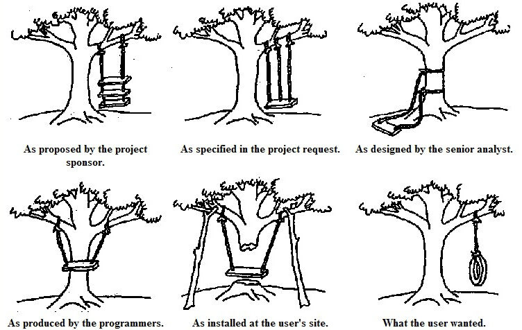
Source: Alexander, Christopher. The Oregon Experiment. 1975
Gap 2 — Lack of explicit details in product vision
There were basic wireframes of individual user flows and some graphical assets that showed the first interpretations from the gathered requirements, which were sufficient for prototyping, but as the product developed iteratively into higher fidelity releasable versions, some features exposed gaps in integration, user interactions, and professional visual details. For instance, buttons with modifying/destructive actions did not follow iOS UI convention and were placed outside the navigation bars. There was inconsistent font sizing where one title was 24pt while another in similar context on another page was 21pt, and similar inconsistencies with margins.
Inconsistent UI is not uncommon in software design, especially when multiple contractors have added features to the app at different times. Consequently, the lack of clear details at the execution level and the ignorance of conventional UI guidelines made the app feel unprofessional and testers had difficulty with the interface. The remedy for these issues was setting and including graphical standards in work orders, and educating the product team on design principles and conventions and how to apply them.
Bit by bit, I summarized the issues and started drawing up potential solutions.
Missing: A Common Language

Source: Cowboy silhouette, 2020
The root problem was misinterpretation of user research into technical specifications. The customer success, design, and development teams have not established a common language to talk about the product with each other.
It’s a common communication challenge for product teams, which is why I approach design as facilitation — providing tools that help each member design and communicate their part of the work. Designers glue the functional teams together as one coherent product team. This constructive approach is sustainable and scalable for product innovation. Teach each member to fish, so we can have more fish! 🐠
Found: a design system
From the results of the design review, it made sense to start establishing a design system because:
► We have a proof of concept, and the product’s core features and tools are stabilizing and ready to scale. For example, patching and extending core features shows the product is maturing.
► There are UI patterns forming in the user flows but are not consistent
► There is funding and justification to set this ground work
► There is a need for better communication and design habits for everyone
Building a design system can be a big undertaking, and persuading stakeholders to invest effort in this work can be challenging. A compelling way to convince the boss to develop this body of work was to divide the activities into small parts with a concise purpose or value, that can be justified with a current objective or task, or as a necessary foundation to an approved future direction (e.g. meeting standards for the health industry). Moreover, implementing the system piece-by-piece made it easier for the product team to consume and train at their own pace, and form good design habits.
With some persistence over the course of a year, the current design system accumulated into these tools:
► Device compatibility support guide and service level agreements
► Proprietary design system — guides for the component library, page layouts, typography, and displaying images online
► Curated quick references to domain knowledge of web and mobile standards and practices (i.e. a wiki)
Implemented a set of accessibility HTML and CSS templates based on the guides
A component library is a must-have in a design system so the product team can create prototypes and implement features quickly and consistently. A sample for MemorySparx created in Sketch.
Learn more about this design system in “MemorySparx — Accessible Design System (Part 2)”!
Do you think you need a design system?
Hit me up at me@jnetix.com!